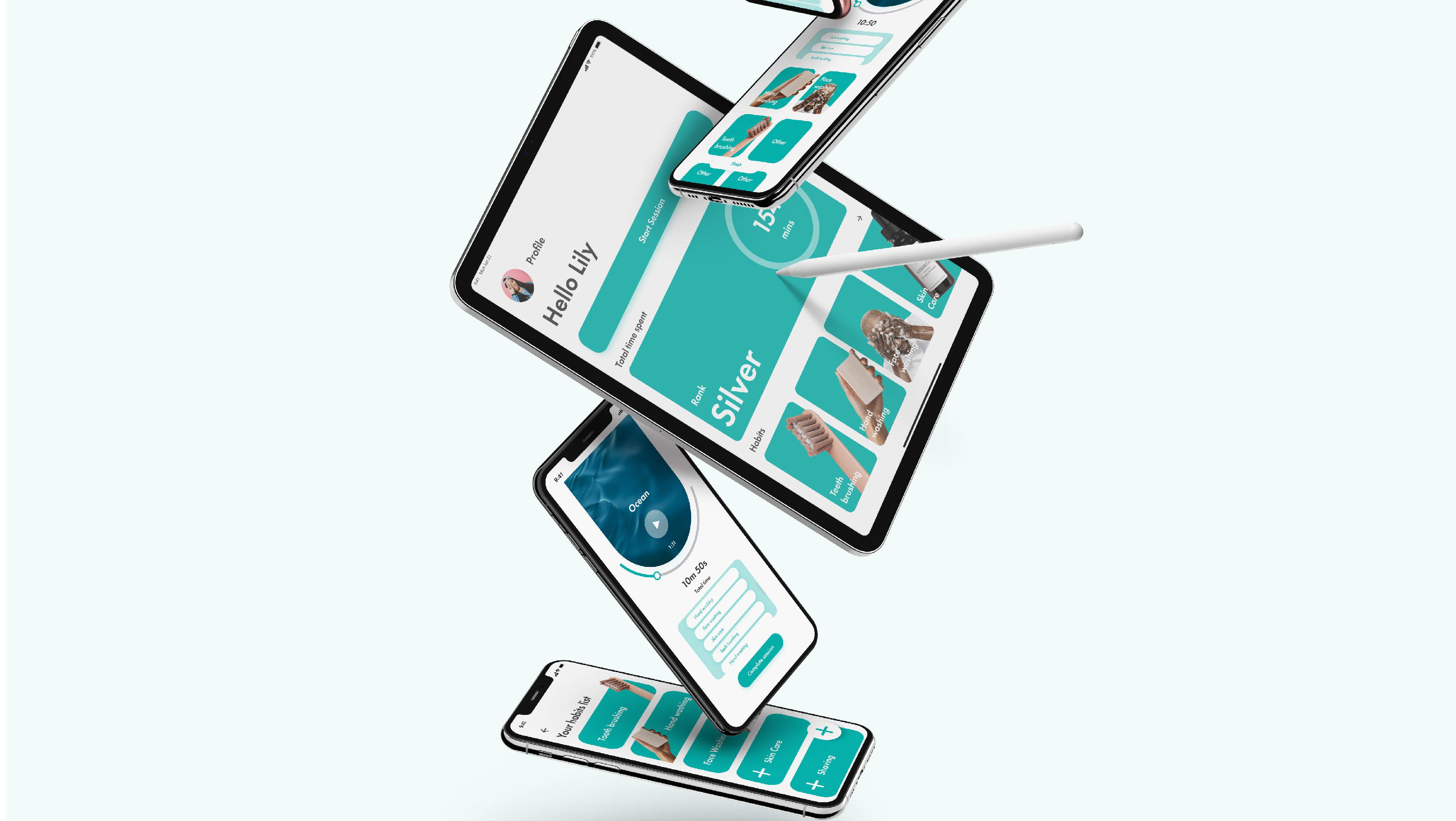
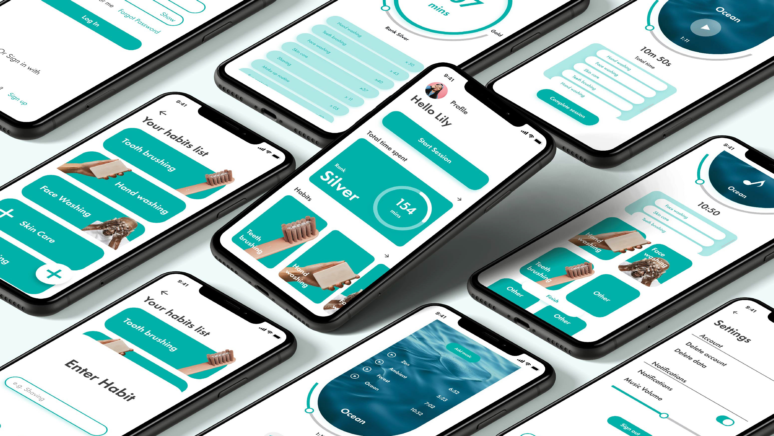
Travel Buddy was a self-made project aiming to tackle the issue of managing and organising travel for users through an app. If I were to do this project again, I would want to have included more UX-based methodologies such as performing user interviews and competitive analysis, however, I will ensure I use this in my next UX project.
Overall I believe the project progressed fairly smoothly, however, I did take up more time and focus on the UI elements and style guide, which instead, I think I should have used to focus on UX practices and ensuring the app meets the user's requirements. Although I am happy with how the UI came out, I also think it is almost too repetitive and should have more variety to make it look more visually interesting.
